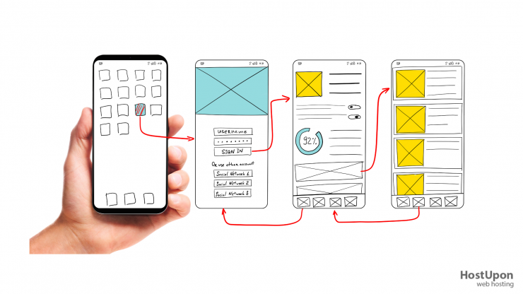
1. Consider all resolutions and use online tools to check usability.
When designing a responsive website, or unique version for your website for mobile users, it’s important to remember there are many different resolutions your viewers are using. From tablets and small smartphones to 4K computer monitors, your website needs to work well on every device.
Test-driving your website before the launch will help you discover which devices the site may not work correctly on. A website like ViewLike.us provides an easy-to-use interface for checking how your website looks on various devices. It’s best to check a few sizes of smartphones (starting at 320×240), tablets (720×1280), and common computer resolutions (1366×768 to 2560×1440).
2. Decide if you need a dedicated site for Mobile
You have two choices for mobile users. You can create a single website that displays content responsively for different types of browsers, devices, and screen resolutions (known as Responsive Design). Or, you can create a standalone individual mobile site separate from your main website at a URL such as “mobile.yourwebsite.com”.
In most cases, choosing a Responsive Design is better for today’s modern websites. It provides a similar experience for the mobile user, as it would on the desktop, and is often preferred for search engine ranking, like Google and Bing.
3. Install Responsive WordPress plugins
If you’re using WordPress, you’re in luck! There is plugins that will take your website and add Responsive features or a mobile version, for you! JetPack and WPTouch are just a few of many available.
It’s even better if you’re using a pre-designed theme that is responsive to begin with. Many of the stock pre-installed themes are responsive, as well as many available in the Theme directory.
4. Match your website branding
The mobile version of your website should be familiar to viewers and incorporate the same branding elements on both sides of the equation. The mobile website is used as a promotion tool, and a customer may just need an easy way to find information about your company, products, or services.
A similar design will make them feel like they’re visiting the same old website they’re familiar with, and that’s important for most loyal customers.
5. Avoid proprietary software addons
This is an easy one: do not use Java, Flash, Silverlight, or any similar plugin on your mobile website as most of the viewers won’t be able to use it. Apple’s iOS os the leading mobile operating system, and neither of the 3 common plugins are available on it.
Convert your videos to HTML5 / Quicktime streaming and replace Flash content with something that is touch friendly.
6. Allow “Desktop Mode” viewing
It’s difficult to know what features of your website the visitor is trying to use, and sometimes a “mobile version” of your website can limit what the view has access to. It’s best to offer a link in the website footer which will redirect a visitor to the real un-modified version of your full site.
If you send visitors to the wrong version of your website, without an option to view the full page, you may be losing customers before they even look at your products!


Add comment